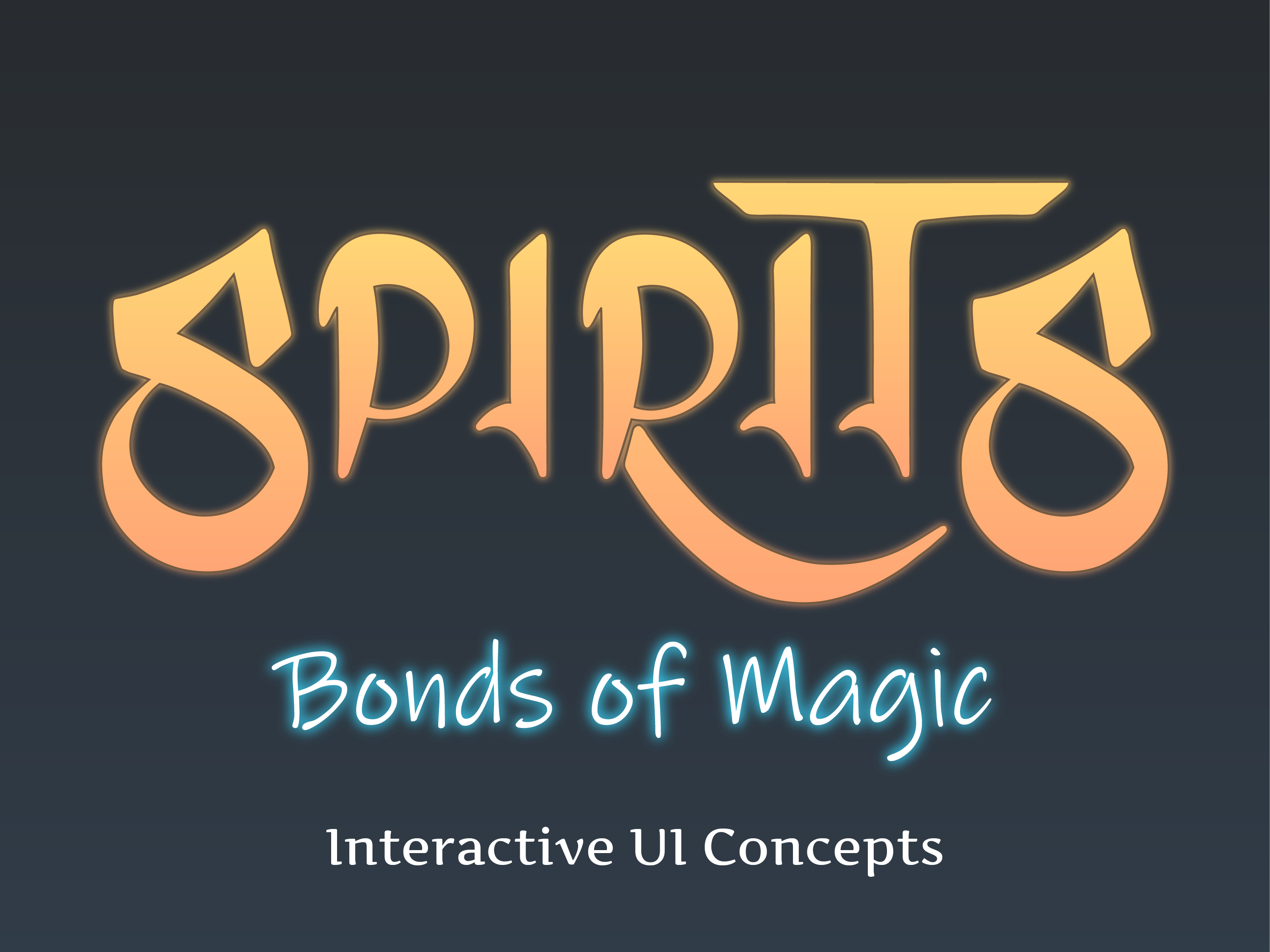
Logo
For our Logo we wanted to dive into a magical-fantasy vibe for Spirits: Bonds of Magic. Keeping various curves and straight edges throughout the logo, we managed to create a dynamic yet elegant feeling that better represents the gameplay and overall world of Spirits.

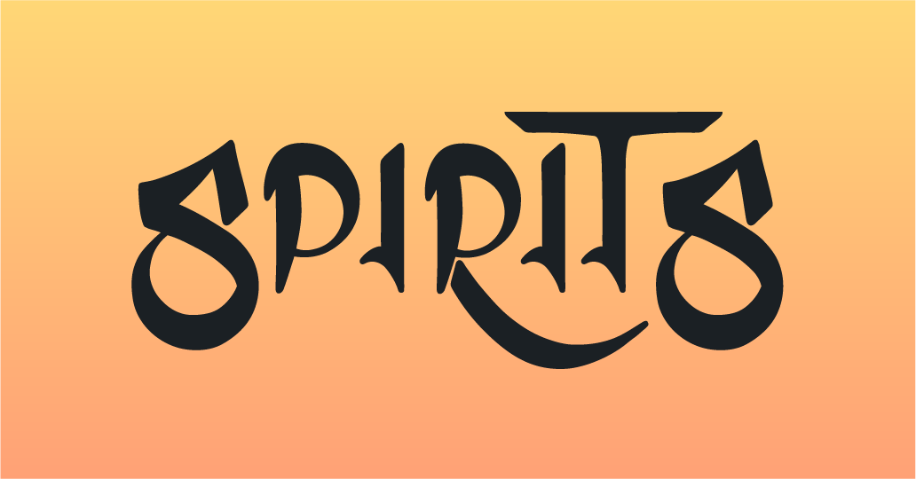
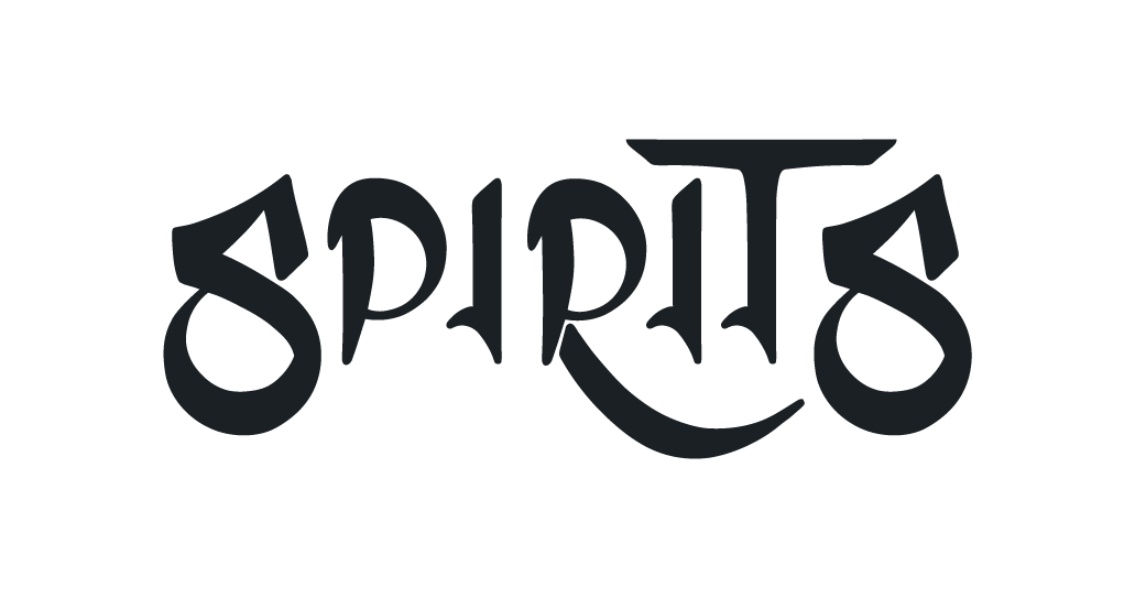
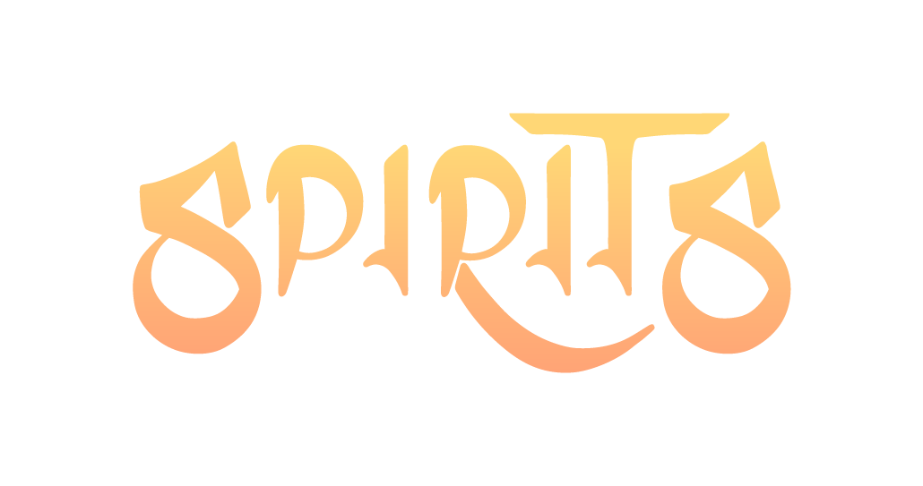
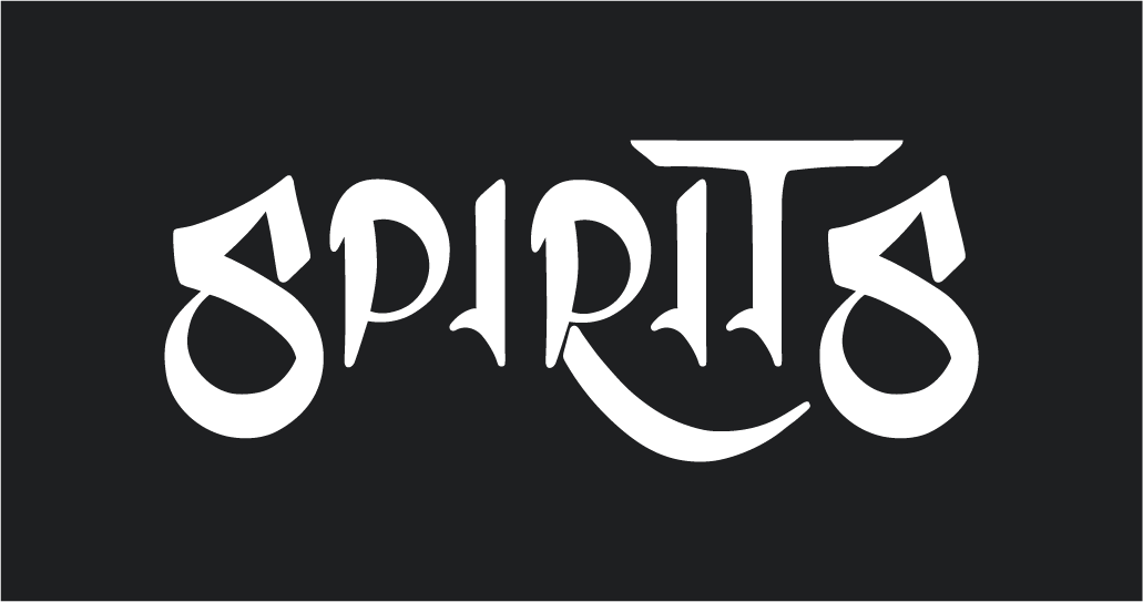

We want to make sure our logo is legible, so we provided some examples that have contrasting colors within our color palate. In the future we'll explore different color usages as long as the logo and background contrast one another.
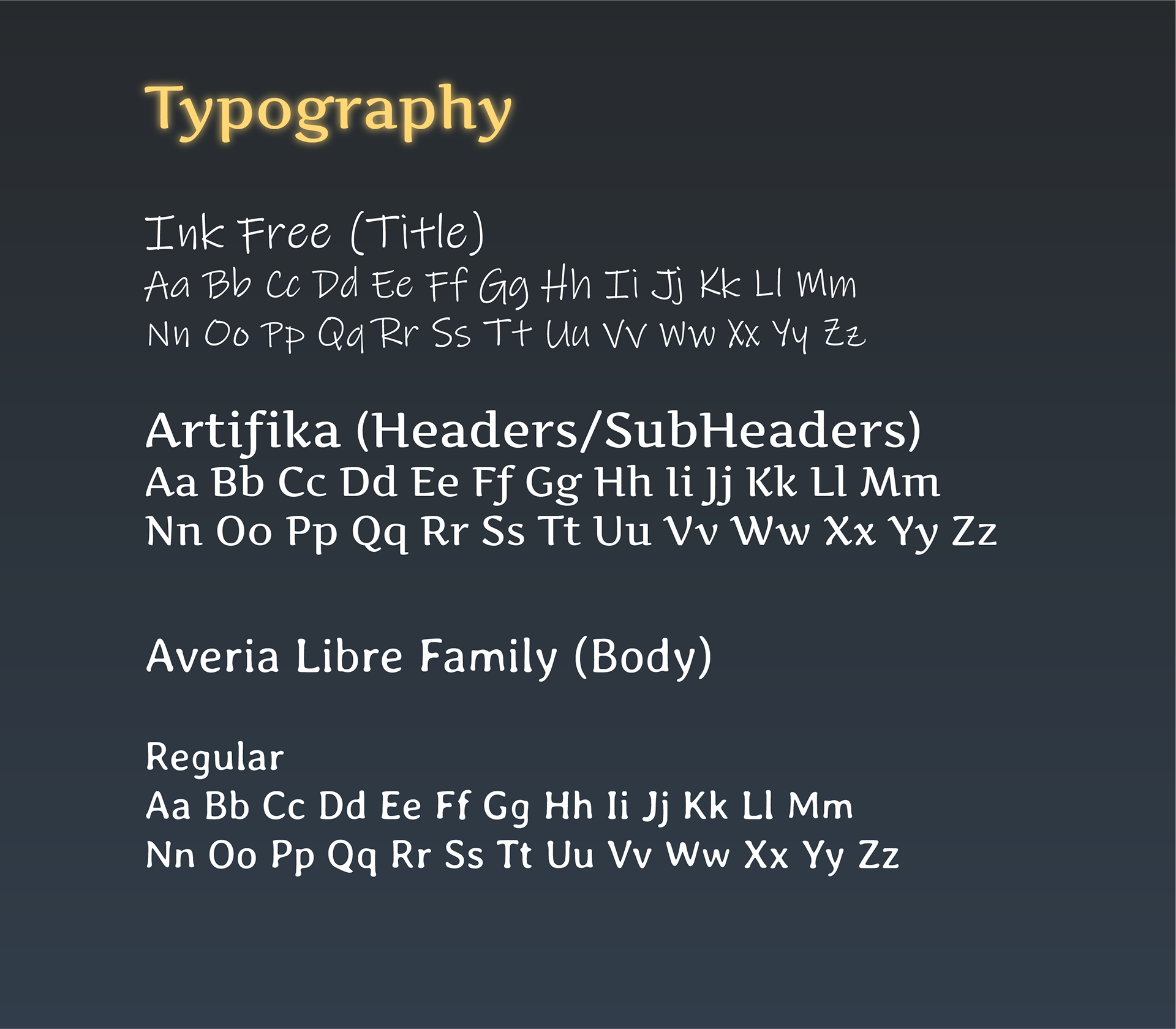
Typography
Our typefaces consist of three font families.
01 - Ink Free represents a magical and personal touch to solidify the Spirit logo.
02 - Artifika is meant to be much more elegant and resolved, much like the royalties and nobles that exist in the world of Spirits.
03 - Lastly, Averia, a combination of both if you will. We wanted something playful and easy on the eyes, as that is what games should m
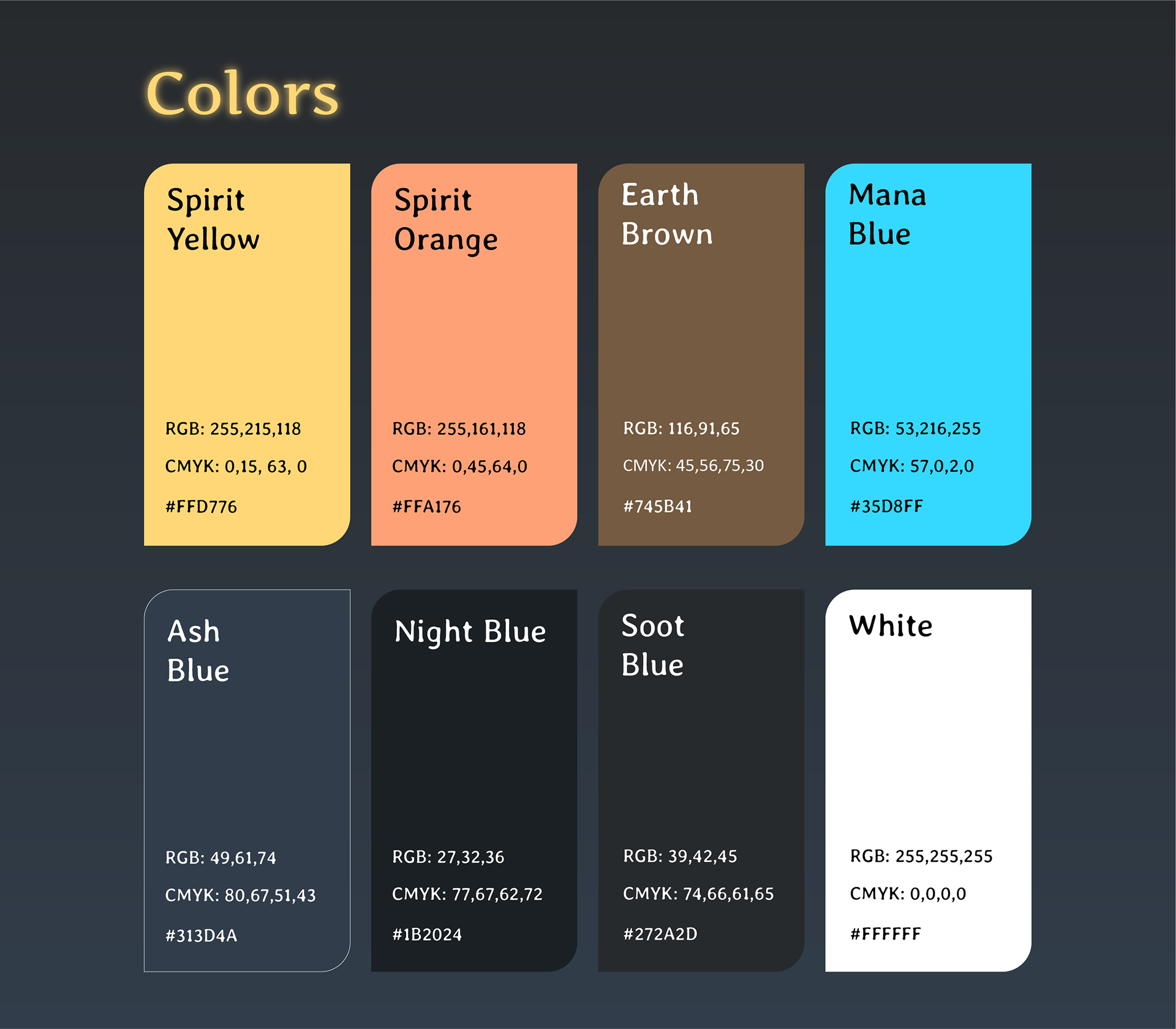
Colors
Our Primary colors reflect the overall theme of the game. With a mixture of warm and cool colors, they represent parts of the game. For example, Mana blue is the raw color of mana when it does not have an element applied to it. Many of these colors have deeper meaning that coexist in and outside of the game.